

5 ways to refresh your direct booking vacation rental website in 2026
As the year winds down, many hosts look for ways to strengthen their competitive edge, making this an ideal moment to refresh your website and meet guests’ growing expectations for sleek visuals, simple navigation, and a booking flow that doesn’t trip them up. Here are five ideas to refresh your website in 2026 with inspiration from actual hosts’ websites.
No. 1: Turn your homepage into a visual itinerary
A compelling homepage should convey what the stay feels like, not just what the property looks like. Immersive, destination-focused photography paired with short experiential cues (“Walk to the beach in two minutes” or “Wake to mountain views”) helps guests imagine themselves in the space before they read a word.
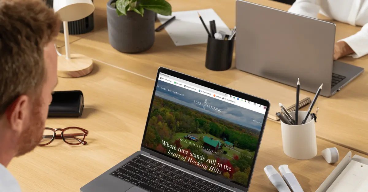
Example: Luxe Hocking
Luxe Hocking in Hocking Hills, Ohio, masterfully embodies the “visual itinerary” principle. Professional aerial photography provides an immediate emotional hook by placing the viewer inside the scene, soaring above autumn foliage, while the 360-degree panoramic view of a country lodge creates a sense of physical presence.
Read more: How to make the most of the off-season at your short-term rental
No. 2: Reduce navigation to 4-6 pages
Too much information and clutter overwhelm visitors and obscure the booking path, according to Jakon Nielsen’s usability heuristics. In line with those concepts, Hostfully recommends limiting navigation to essential pages such as:
- Home
- Property descriptions with video and photo galleries
- FAQs
- Local guide or blog
- About
Example: Wheeler House Vermont
Wheeler House Vermont in Charlotte illustrates this beautifully with a minimalist top navigation that lets travelers find everything within one or two clicks, including local recommendations.
No. 3: Add calls to action above the fold
Guests shouldn’t have to hunt for the “Book Now” button. Placing your primary call to action above the fold on desktop (the area of the homepage before you have to scroll down), immediately visible on mobile, and consistently across all pages creates multiple entry points into the booking flow.
Example: Hilde Homes
Hilde Homes places its “Book Your Stay” button prominently at the top ride side of the page, ensuring it’s visible as soon as the site loads. The simple layout and photography naturally guide the eye toward the call to action.
Read more: Website Building Blocks for Direct Bookings
No. 4: Infuse “trust indicators” throughout your site
Trust indicators, like reviews, badges, straightforward policies, media mentions, contact options, and professional photography help instill confidence in booking with you. Sprinkle these throughout your website to build rapport with your visitors.
Example: Southwest Wanderlust
Southwest Wanderlust excels at establishing trust quickly. Warm, atmospheric professional photography pairs with trust badges, the team’s faces, and vendor names, like Well & Good Professional Services. For example, the website’s “About Us” page features badges such as Arizonans for Responsible Tourism, Vrbo PremierHost, and Airbnb Superhost.
No. 5: Make the booking process easy
A stunning website won’t matter if visitors get stuck on how to book. Encountering slow-loading pages, hard-to-find availability, or payment glitches can drive them back to OTAs or a competitor’s site.
“Time-pressed travelers crave a quick and easy way to book their stay,” notes the team at Hostaway. “A user-friendly website allows them to quickly find the information they need and book their stay with minimal hassle. The easier it is to navigate your website, the more likely visitors are to convert into paying guests.”
A seamless booking experience typically includes:
- A clear “Book Now” or “Check Availability” button
- A fast, mobile-optimized booking engine
- Transparent pricing and fees
- A short, intuitive reservation form
- Minimal redirects
- Instant confirmation
Guests should feel guided, not tasked, with completing the reservation.
Example: AvantStay
AvantStay.com exemplifies this principle with a booking path that feels direct and intuitive. When visitors click on a property, it appears in a separate tab, so you can go back to the main directory quickly. The “Check Availability” button appears instantly on each property page and allows you to check dates without a redirect to another page. The availability calendar loads quickly, pricing details are clear, and the reservation form is concise.
If you’re planning updates for 2026, these five areas are a smart place to start. A simple menu, captivating imagery, or a smoother booking flow may be the thing that tips a guest from browsing to clicking “reserve.”
Read more: Improving your vacation rental content SEO
By Paris Achen
…